Your Body Works Better With Bürgen
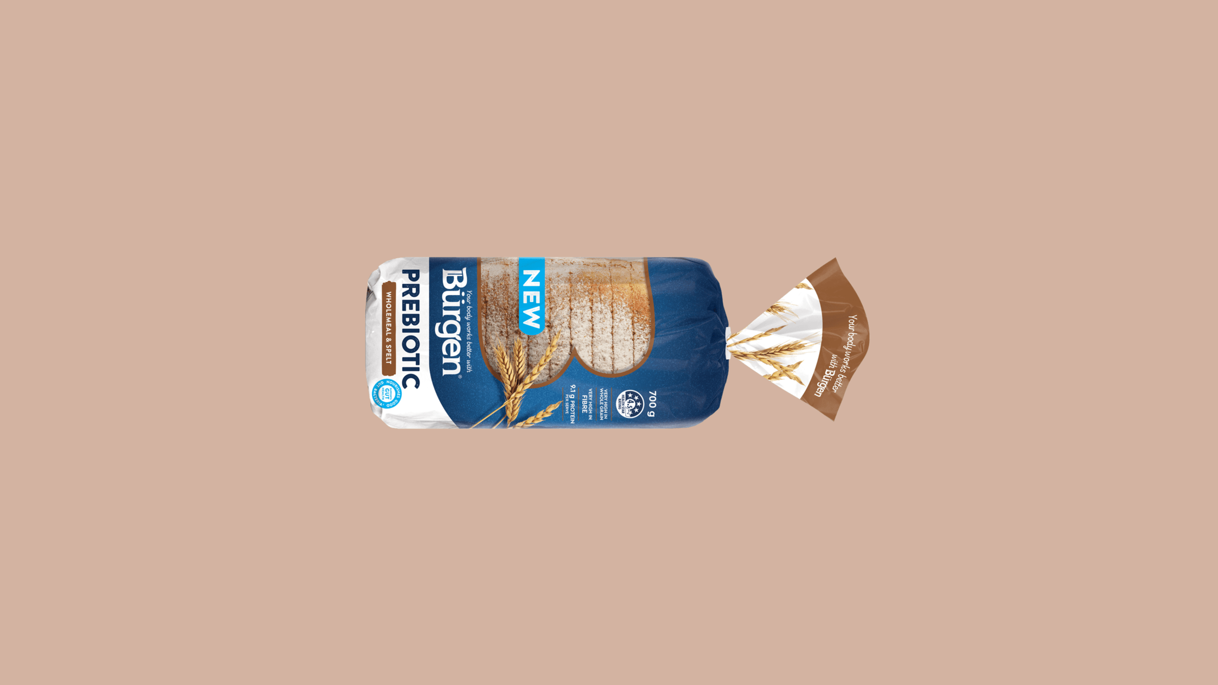
Bürgen Bread
Bürgen asked us to develop a new brand tone and personality to help it stand apart in the bread market. Only issue was, their budget was slimmer than the bread.
To promote the launch of its new prebiotic bread range and set the new brand tone into motion, we used copy-led executions and simple, in-house photography to make the lacklustre budget work to our advantage.
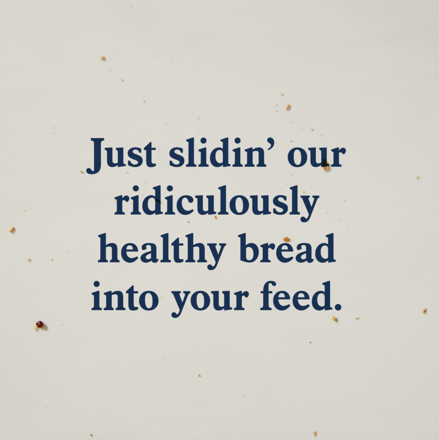
Bürgen has always been known for its health credentials, but now it’s known for its distinct and witty tone of voice too - one that deliberately disregards marketing tactics to focus on what it’s good at.


Bürgen’s new comms is punching well above its weight on par with Golden - the market leader with (probably) 10 times the budget.
Proof that size doesn’t matter after all.
Creative Director: Miriam Wells
Designer: Dom O’Connell
Photographer: Mat Zammit
Stills and Video Editor: Will Palmer-Reeves